Evaluation

In this blog I am going to take an overall look at my Final Major Project and assess what was good, what was bad, and what needs improvement.

This is my proposal, which clearly represents my goals at the beginning of this project:Capture

I certainly think I achieved most of my aims, especially when it comes to research. I researched into everything I said I would, and I think it’s safe to say that I did it in detail. The exception here would be research into how thought process and dreams are portrayed in film. I didn’t get into that because I decided to use Terrence Malick’s style to portray dreams, so there was no real reason to research into other techniques.

I think I could improve on the actual execution of the film. I wrote that I wanted the film’s story and aesthetics to go hand-in-hand, and while I achieved that to a certain extent (some shots have symbolism and actually represent what or how the characters feel), most of the shots that I had planned didn’t make it into the film. I think that if I had held true to how I had originally planned the film out, it would have turned out much better than it did.

I also think the message of the film could have been clearer. While the message is conveyed (The message being that things are easier with less emotional investment, which, I admit, does sound very dire. If I could revise the proposal I probably would have changed it to ‘move on to better times,’ which is slightly more upbeat.), I believe that the fact that I decided to change the ending can be felt in the slight lack of closure, causing a little bit of a confusion as to what the message is.

Next year I want to improve by taking more time to get every shot exactly the way I want it. There is probably only one or two shots in this year’s film that I feel like I absolutely nailed. Of course, you should never be completely happy with what you have achieved, but I do think that with more of a perfectionist attitude I can make a much better film next year.

I have learned a lot during these 12 weeks and I think that the project turned out okay, but there have been a lot of chaotic moments during this production. I really learned that time is everything. We had 12 weeks, and for the first 4 I didn’t really do anything because everyone was doing research. I had already chosen my project before we even started working on it so I knew what I was doing, which made it very easy for me in pre-production. My research and planning were done fast but by the time we finished actually filming the film we only had a week left. I think I dealt with this well, however, because I started on the editing as soon as we had any footage whatsoever. This meant that while actors and crew members weren’t available for filming, I was still making progress, and I think if I hadn’t done that the project wouldn’t have been finished in time.

As far as ambition, I think my project was quite ambitious, but not overly ambitious. It is more ambitious than a music video, since you have many more elements to deal with (the main one being sound, which can be absolutely gruelling), but not as ambitious than, say, an animation (because of the sheer amount of skill you need to gain to pull something like that off).

My aims also weren’t particularly high, but they weren’t set low either. I set out to do a dramatic short film which needed to develop character, have an interesting story, I wanted to convey a message, and I wanted there to be symbolism in many of the creative choices I made. Then there is also the aim of using techniques that other filmmakers have used but trying to use them in a different way.

I also think I improved my skillset in the sense that I learned from my mistakes. Of course I improved my skillset by looking into things like colour grading the montage to make it look like it was shot on film, and learning about lenses to get the Terrence Malick look I wanted, but mostly I developed my skills based on what I did wrong. This is because next year I’m going to remember all of the things that I know would have made my film better this year, and I’m going to pay special attention to those things. For example, next year I am going to triple check my focus, plus ask all of the cast and crew to check the camera just to get it as precise as possible.

One of the reasons I think my project is fairly successful is because of research. I love doing research, and I think that really helped me with this project because I did a lot of it. This is true especially when it comes to cinematography. By researching films like ‘Raging Bull,’ ‘Moonlight,’ ‘Blue Valentine,’ ‘In the Mood for Love,’ and Terrence Malick’s entire filmography I really found a way to elevate certain moments, distinguish the real world from the dreamworld, show what characters are feeling through just a single image, etc. A specific example would be whenever I wanted to show that the characters are experiencing an important moment. I wanted to heighten the scene, really show the inner turmoil. I used several influences. ‘In the Mood for Love,’ for its brilliant slow motion, ‘Raging Bull,’ for its dolly zooms, and ‘Moonlight,’ for its 50 frames per second 1st person viewing experience which puts you in the character’s shoes.

Lastly, the greatest problem I faced with this Final Major Project has definitely been the fact that I thought that the ending was going to be horribly grainy and dark. At first I tried to just fix the footage as much as I could by colour grading it but it didn’t look much better. After that, while we were filming the dream sequence we just decided that if she takes her ring off I can edit it so that the ending just happens before it was meant to originally. This was probably the single best decision we made during the 12 weeks, considering the tremendous difference in the quality of the film.

Crits

A part of this Final Major Project is also critiquing others and receiving critique from other students. My work was officially critiqued by Drew, who also played Brad in my FMP. This is the crit:

CaptureCapture1

As you can probably guess, I’m really happy with this crit because it says that I’m doing very well, but I would have appreciated some constructive criticism.

Throughout the editing process of my FMP I also showed parts of my film to people to get some kind of general response. It has been overall positive and useful in pointing out certain things that I could change to make the film better.

Everyone enjoys the montage sequence the most and I think it is definitely one of the strongest, if not the strongest part of my film.

The Things I Didn’t Use

In this blog I will show evidence of everything that went wrong and everything that I decided to not use in my FMP. I’m also going to show some evidence of my initial planning which is why I’ve decided to put this blog in the ‘Sketch’ category and the ‘Planning’ category.

First of all, the script. I’ve said from the beginning that the script was going to serve as more of a guideline than an actual screenplay and that’s how it was. I used it to explain what’s going on in the scene to the actors but I insisted that the lines were made up by us on the spot, or improvised by the actors as we were filming. I think this gives it a more realistic feel, and I think that helps make the film less cheesy. I also ignored the script completely at the end and changed the ending drastically because of the grainy and dark footage.

Speaking of the ending, in the original version this was supposed to happen:

As you can see, the footage is absolutely awful. The grain is extremely distracting and despite having colour graded this it still looks too dark. These are some examples of before and after colour grading:

Before:Capture9

After:Capture10

Before:Capture13.PNG

After:Capture14.PNG

Before:Capture11

After:Capture12

Horrific. Just horrific.

I think there are still some good ideas in this, I really do. It’s just the execution that makes it unwatchable. For example, the very last shot is her turning off the radio and then exhaling in relief, which tells us that, finally, she’s over her fiancĆ©’s death. We don’t need an explanation, just that exhale, the lean on the wall, and the slow dolly out of the camera (although it isn’t a dolly, it’s a tripod on a skateboard). I think that if that idea was executed well that would be a really good final shot. It’s a frame within a frame (the doorway), plus it shows her facing towards the right of the screen, while in the very first shot of the film she’s facing left, showing that now she is looking and moving forward.

First shot:Screen Shot 2017-06-10 at 12.45.33.png

Last shot:Capture12

The way I envisioned this ending reminds me a lot of ‘Mad Men’ (a prestigious TV show that has great concept and great execution). The show is famous for its subtle and often ambiguous nature. There are many scenes where we have to figure out what is happening by just watching a character emote. There is a scene at the end of season 1 which perfectly represents what kind of ending I was going for.Ā It ends on a character thinking, and something about that has always appealed to me. It says a lot about the character without explicitly telling us what he’s thinking, all he needs to do is sit down on the steps and look sad. This is the scene:

That’s what happens when great writing (the concept) meets great direction and acting (the execution). Of course ‘Mad Men’ is an award-winning TV show and my film, simply put, isn’t going to be an award-winning anything. Things just didn’t work out how they were supposed to. We were rushing the scene because everyone wanted to get home, the room was too bright with the curtains open and too dark with the curtains closed, the camera was shaking because it was on a skateboard, etc.

As I have said before in my ‘Blog the Week’ posts and have made clear above, I like to frame shots in a way that gives them meaning or add something to the character or story.Ā In fact, I had made a shot list for most of my film before I realised that some of those shots are impossible to do.

Shot List Scene 1

Shot List Scene 2

Shot List Scene 17_18

First of all, a lot of these are moving shots which is difficult to do without a slider. And since I don’t have a car I need to carry the equipment home, which limits the amount of equipment I can use quite vastly.

Secondly, since I used a prime lens (50mm) for a lot of these shots I had to do certain shots as close-ups instead of medium close-ups or medium shots. This really bothered me because I don’t like to use close-ups unless we really need to focus on a character’s reaction. For example, when we first see Louise we show her in a close-up for no real reason.Screen Shot 2017-06-10 at 13.11.20.png

This shot was made by putting the camera onto a bed next to a wall, so it was the furthest away from her it could’ve been, which still resulted in a close-up.

I also planned to use the montage sequence as the opening credits but they wound up being in the middle of the film, so the credits would have seemed out of place.

The last thing I want to talk about that I didn’t end up using is the scene I actually added in later on during the production. It’s the scene where Brad shows Louise the song which ‘he had written.’ The scene was supposed to show them getting engaged but I decided to cut that out of it because we just couldn’t make it work.

Final Piece

I’m finally done with my Final Major Project and this is how it turned out:

I am going to do an overview of the whole project in my ‘Evaluation’ blog but here I just want to go over some creative decisions and why I made them.

First of all, I gave the film a 1.85:1 aspect ratio because it’s the same as in ‘Raging Bull,’ a film which is a big influence here, so I wanted to give it at least a slight homage.

I also tried to give the real world a quite boring look while the dreamworld and the heightened moments in the film (e.g. when the characters meet) have an over-saturated and colourful look.

These are some examples of before and after colour grading:

Before:Capture

After:Capture0

Before:Capture1

After:Capture2

Before:Capture7

After:Capture8

Before:Capture3

After:Capture4

Before:Capture6

After:Capture5

My film opens with just Louise in a room, scrolling on a laptop.Screen Shot 2017-06-10 at 12.45.33

After that we cut to flashback where Brad gives Louise the song that he wrote for her. In this moment I didn’t have a slider to slowly dolly in from a medium close-up to a close-up but I decided to try and give the moment the same kind of effect with the saturation. We begin like this:Screen Shot 2017-06-11 at 10.52.06.png

And we end like this:Screen Shot 2017-06-11 at 10.52.18.png
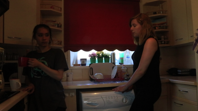
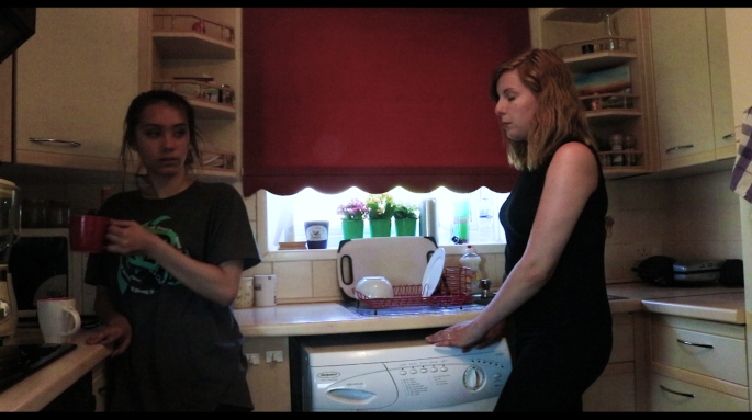
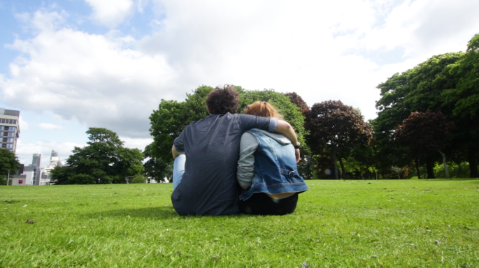
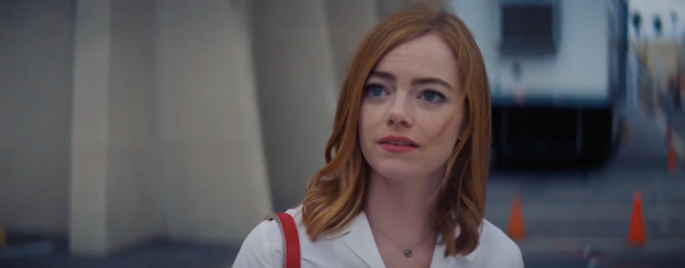
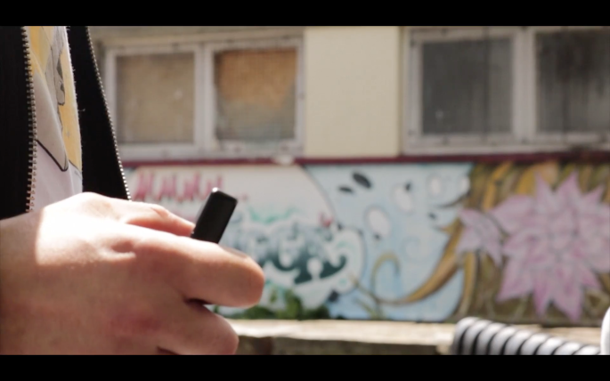
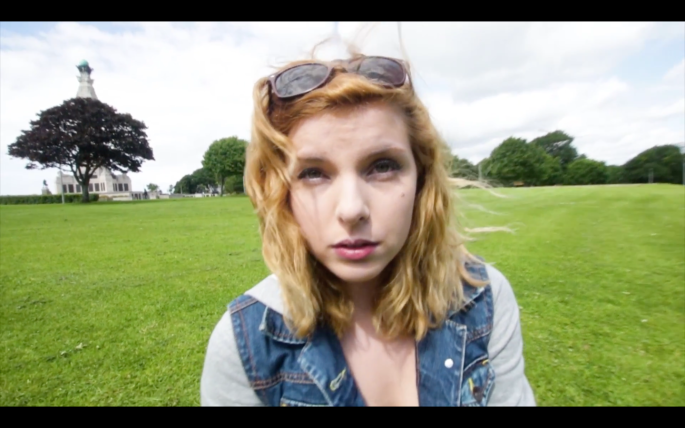
This shows that the character feels happier, it gives the scene an elevated feel, and I wanted that whenever the music is playing.

Then we cut back to reality and what follows is probably the worst shot in the film. It is when Louise finds out that Brad is dead. I wanted to show that the world around her is changing, which I tried to show with a dolly zoom.Screen Shot 2017-06-11 at 10.52.56.png
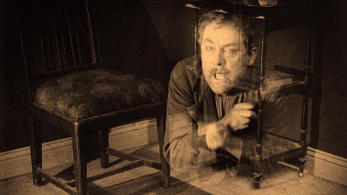
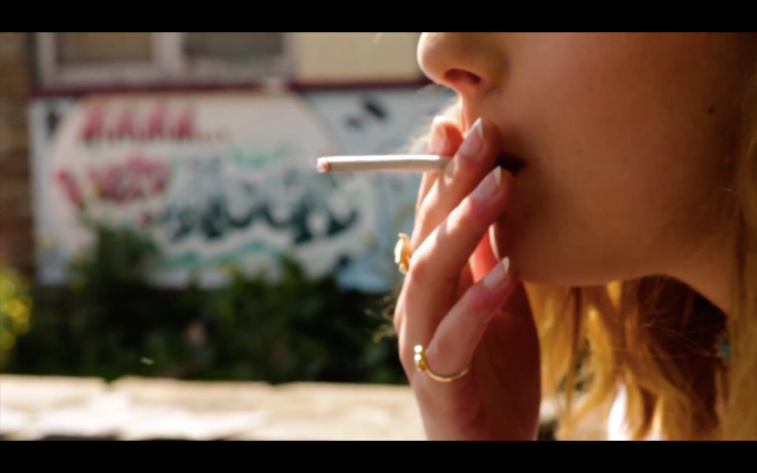
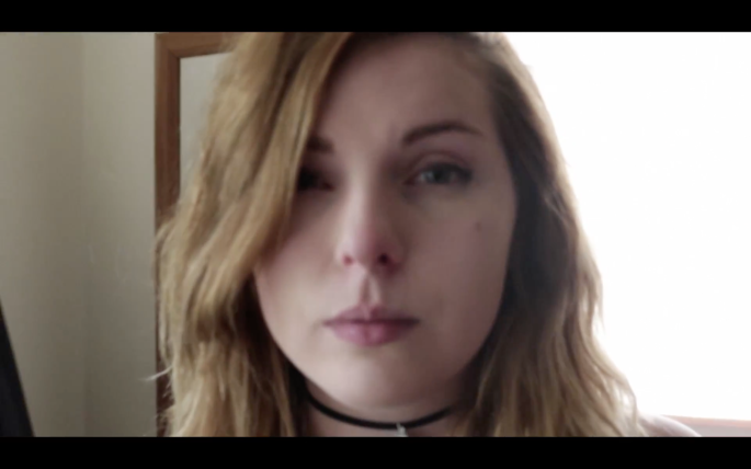
I tried this shot about 20-30 times so that everyone was getting slightly pissed off at me. Whether it was my hands shaking, or the performance not being how I wanted it to be, or my finger in the frame, somehow this shot just didn’t go well. This ended up being the best take. I also added the sound effect of the fire which we hear more prominently in the next scene. The sound of the fire is kind of (like the music) a symbolic representation of Brad and their love, so I wanted to highlight it here as well.

After this we go into another flashback, which is where Brad and Louise meet. Louise can’t find a lighter so Brad, who just happened to be going by, provides it for her.Ā This scene has the best shot of the film, in my opinion, and just like the worst shot of the film, it is also a dolly zoom. This just goes to show how good it can look, but how difficult it is to achieve. I also tried this one about 20-30 times, and this was the only one that worked. This shot is also probably the only shot that looks exactly how I envisioned it in my head when planning this scene. I also used saturation to heighten the scene again, and as music began to play we went from this:Screen Shot 2017-06-11 at 10.59.51

To this:Screen Shot 2017-06-11 at 11.00.02

As Brad lights her cigarette we hear the fire sound effect again.Screen Shot 2017-06-11 at 10.53.48.png

And after that we go into the montage sequence, which is supposed to sell us on the fact that these are real characters in a real relationship. I don’t know if it succeeds in that, but most of the people who have seen the film so far have said it’s the best part of the film so it succeeds in something.

At the end of the montage, which shows their perfect relationship we have a moment where Brad covers up the camera, showing that everything isn’t quite perfect, because it never is. This ties into the ending, which I’ll talk about in a bit.

We then go back to the real world, where we can hear the sound effect of the fire again, as we see Louise’s face taking in the news of Brad’s death.Screen Shot 2017-06-11 at 10.54.54

The music and the fire sound effect then get cut out by the zippo closing, just like their life together got cut out by Brad’s death.Screen Shot 2017-06-11 at 10.54.45

Then we fade to 6 months later, where we see Louise in a kind of bubble of sorrow. We see her in a space where everything is kind of brown and yellow, except for the room she’s in which is blue, the colour of sadness.Screen Shot 2017-06-11 at 10.55.28.png

After slamming the door on her friend she then sits down on the ground and we see this shot:Screen Shot 2017-06-11 at 10.55.50.png
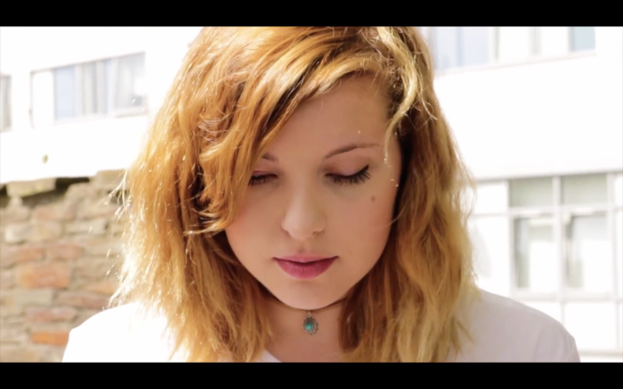
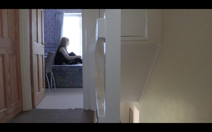
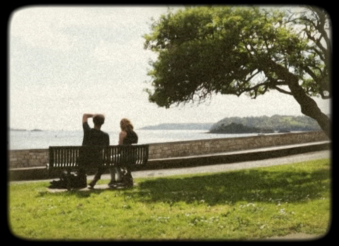
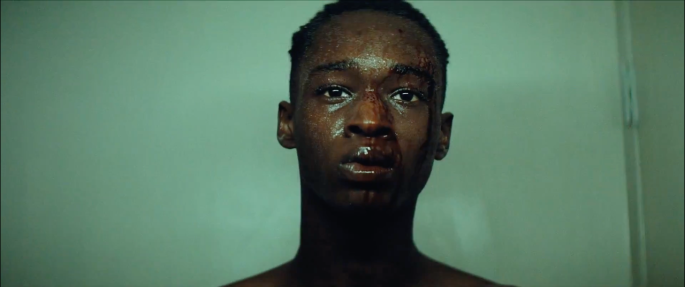
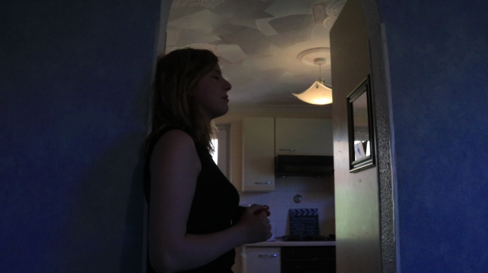
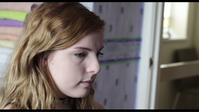
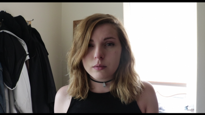
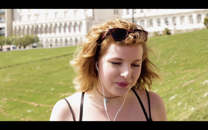
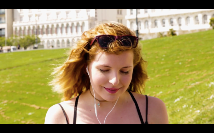
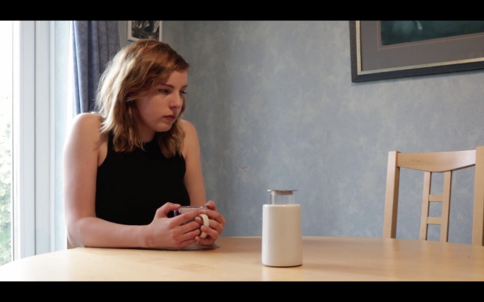
I actually thought of this shot on the spot, and I immediately knew I’m going to like this shot a lot, and I was right. I like it because it traps the character on the edge of the screen, just like she feels trapped in an unhappy world.

After this we get a quick glimpse of a Terrence Malick style dreamworld where music is playing, everything is very saturated and the aspect ratio is now 1.77:1, opening up the screen.Screen Shot 2017-06-11 at 10.56.08Screen Shot 2017-06-11 at 10.56.40
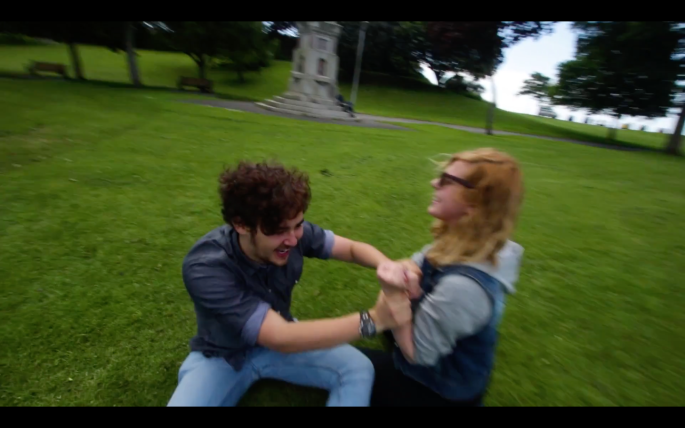
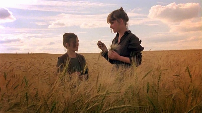
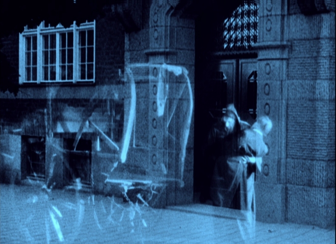
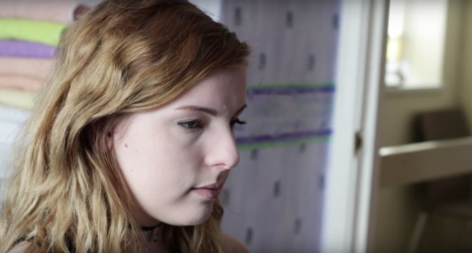
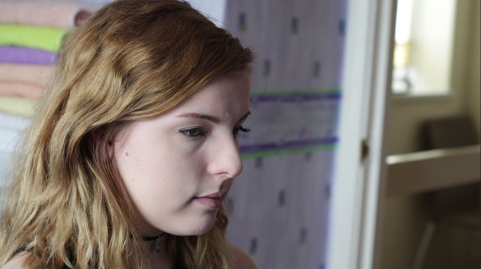
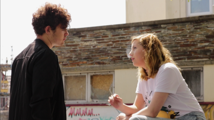
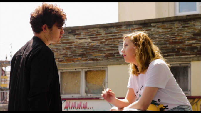
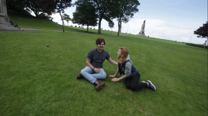
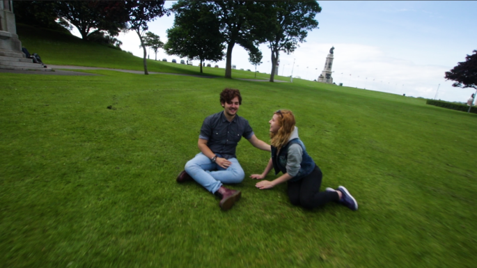
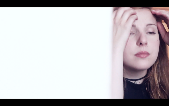
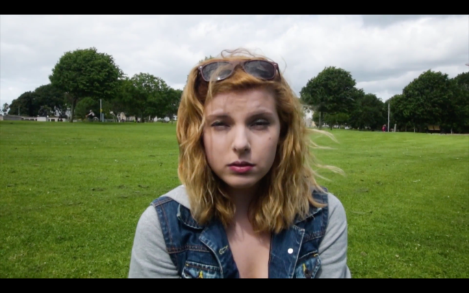
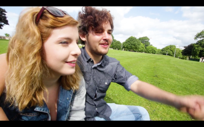
I really love Terrence Malick, but I can definitely see why people don’t. His style isn’t for everyone, and it seems to be there just for the sake of his films being stylish. I tried to use this style in a way that makes sense, so I decided to apply it to the sequence in Louise’s head. I think this was a good idea because a lot of people compare his style to a kind of dreamworld so this was a perfect fit. Since the actors had never heard of Terrence Malick they probably had no idea what I was doing, since, mostly, I just walked around them with the camera and asked them to do whatever they wanted. We didn’t have time for actual voice over so I decided to record the dialogue in the same field, which resulted in some audio issues (a lot of background noise) which I mostly removed with Adobe Audition, but can still be heard.

Louise is telling Brad that she misses him and that their life together was going to be perfect. I cut this together with some footage of the future where everything does indeed work out and they end up happy. I actually took this shot when they didn’t even know I was filming. They thought I was setting up the camera so they just started talking about something and I pressed the record button for about 15 seconds.Screen Shot 2017-06-11 at 10.56.56

Then Brad starts talking about the fact that their future could have been terrible just as easily as it could have been great. Here, I inserted some footage of the future where it doesn’t work out. I also decreased the saturation and contrast just a little in this part, but you can barely see the difference.Screen Shot 2017-06-11 at 10.57.03

After Brad says “We could’ve not been in love,” which was a great line that Drew came up with on the spot and everybody loved, Louise asks why he’s saying these things to her. He replies that he isn’t saying them, “It’s all in your head.” That’s when we get the last dolly zoom, which is the reverse from all the other dolly zooms in the film. With the others I zoomed out while moving the camera closer, while with this one I zoomed in while moving the camera further away from the actress.Screen Shot 2017-06-11 at 10.57.54Screen Shot 2017-06-11 at 10.57.57
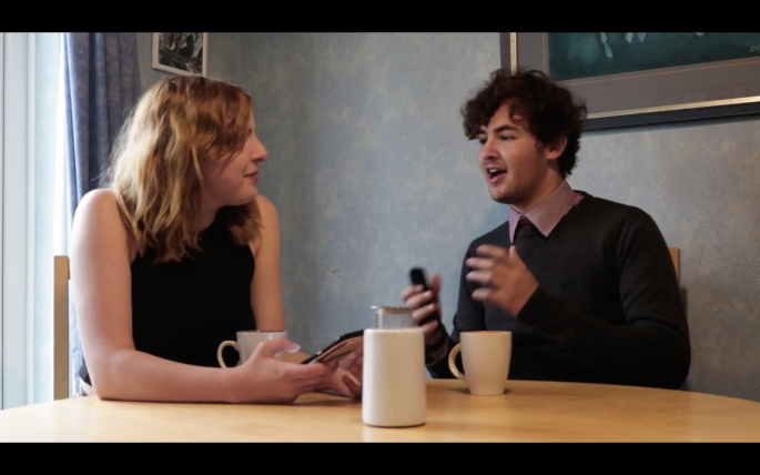
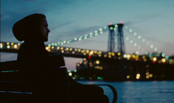
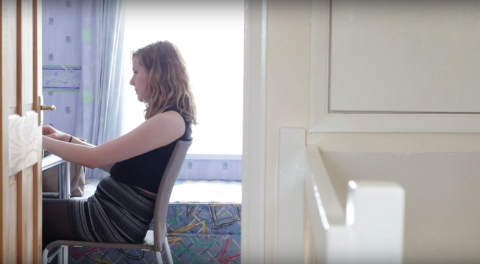
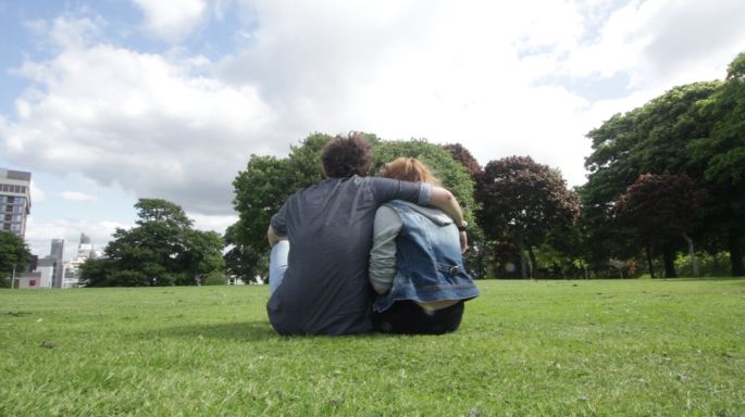
For the first time, this results in the exact opposite effect, just like, also for the first time, Louise is able to get over Brad and realises that their life probably wouldn’t have been perfect.

Then we get this shot, which shows her alone, just like she has been this whole time:Screen Shot 2017-06-11 at 10.58.01
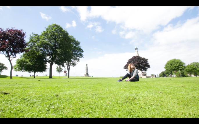
She sees that it was her who was thinking about their life together being imperfect, and not Brad.

Then we cut back to the real world, where we see Louise taking this all in before one last glimpse of the dreamworld where she takes her engagement ring off, obviously symbolising she’s ready to move on.

The last shot of the film is this:Screen Shot 2017-06-11 at 10.58.42
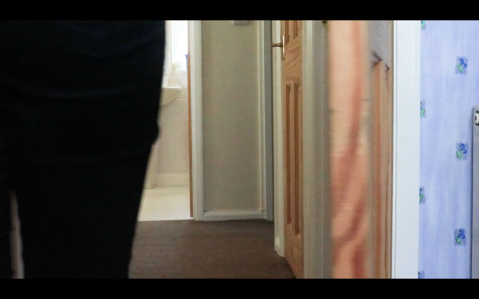
It is Louise opening the door. Many great films end on a door being closed.

‘The Godfather:’

‘Goodfellas:’

‘The Searchers:’

But I wanted the door being opened because if the door being closed is a symbol of closure or a story being done, then opening the door symbolises a new beginning. And that’s just what Louise can now move on to – a new beginning.

Blog the Week: Week Beginning 5th of June

This was the last week before we have to hand in all of our work and it has come down to the wire. I’ve finished the film and now all I have to do is add the credits and that’ll be it.

I had already finished editing before the beginning of this week but I still had a scene to shoot, which I now have. I also took this opportunity to cut out the original grainy ending and replace it by tying up the loose ends in the scene we shot this week. I really think this is what salvaged the film. Now at least the film doesn’t go from a bad beginning to a horrible ending, it stays merely bad throughout the whole film. There are some good moments, for sure, and a couple of shots are exactly how I imagined them, but overall I think it turned out mediocre at best.

The last scene that we shot is the dream sequence (or daydream sequence) and I wanted to give it the style of Terrence Malick. I did that by filming the actors mess around for about an hour and then, in editing, insert the dialogue as voiceover rather than just showing the characters speaking to each other. I also found a nice field, which is a staple of Terrence Malick.

‘Days of Heaven:’f8e2f-days-of-heaven-3_2

‘The New World:’large_new_world_blu-ray_1x.jpg

‘To the Wonder:’tothewonder1.jpg

I am going to analyse the film in depth in a blog called ‘The Final Major Project’ and I will talk about everything that I decided to keep out of the film (including the original ending) in a blog titled ‘The Things I Didn’t Use.’

Blog the Week: Week Beginning 29th of May

This week was half term but since I had done almost no editing whatsoever by the start of the week I decided to go to college anyway and I have to say that might have been the best choice I’ve made regarding this project.

Since the college is pretty much empty during half term there aren’t any distractions and focusing on just the editing is much easier. I actually finished all the editing andĀ colour grading that I’ve been able to do so far. Just as I thought some of the footage ended up being very grainy and I ended up adding some noise to the rest of it just to get it to match. It gives it kind of a cool film look, but it is also quite obvious where the grain was added in post-production and where it wasn’t.

Now all I need to do is film and edit one more scene next week and I’ll be finished. I also did some Foley to fill in the gaps (I recorded the sound of some footsteps, the radio turning on and off and the sound of a touch-pad on a laptop). As far as how the project is coming along I’m not really very happy with it but I’ll discuss why and what I can do to improve my future projects in aĀ blog about the finished product.

Colour Grading the Montage Sequence

Since my FMP is a short film there isn’t much room for character development, which I can already see is going to be a big issue, so I decided to have a montage to get us at least familiarised with the characters, if not slightly attached. At first I was going to use the montage like Martin Scorsese used it in ‘Mean Streets,’ where he included opening credits whilst showing us a montage of ‘home videos’ in which we get a glimpse of the characters, their lives, and their personalities. I decided that the montage was going to be shown without credits because I just didn’t think it fit very well. The old film style, however, in which I wanted to present the sequence can only be achieved through colour grading, so I decided to begin experimenting with it before I begin colour grading the rest of the footage.

What surprised me first was that the montage looked really good without any colour grading. This is how it looked before:Capture7

The colours are really nice and the contrast isn’t bad, considering how washed out it could have been. After I watched some videos on how to colour grade a video to make it look like it was shot on old film I ended up with this:Capture6

I began by adding RGB Curves to the footage and playing around with the whites which made the footage look more washed out.Capture1

Then I tinted the footage to make it look more brown and yellow. Films from the late sixties/early seventies weren’t really tinted but the home movies were, and that’s the kind of tone I was going for with this montage.Capture2

The tint also kind of reminds me of old silent movies that used to look like they only had one colour.

‘The Phantom Carriage’ (1921):phantomcarraige3bigimage-w1280

Of course I didn’t tint the footage that much but it does look more yellow and brown than the original.

After tinting the footage yellow and brown I also added a bit of blue with the Fast Color Corrector to give it a nice balance.Capture3

The next thing I used was Roughen Edges which I used to shape the cornersĀ of the screen.Capture5

I did this because it’s how the montage from ‘Mean Streets’ looks, plus I like this more than the sharp corner look the original footage had.mean_streets_t

The last thing I did was add the grain which I might have gone slightly overboard with and will probably reduce slightly.Capture4

After playing around with the colour grading I added in the countdown that old movies had, as well as the sound of a film reel which adds a really cool effect and helps with the immersion. I also sped up the footage to 120%, again, to add to the immersion of watching something that was actually shot on film.Capture

This is the montage so far, but I have yet to reduce the noise and add the music that will be playing over it.

Blog the Week: Week Beginning 22nd of May

I have almost finished all of my filming for my FMP and only have one scene left to shoot. The footage, however isn’t good at all. It is too dark (despite the large aperture) and I didn’t want to overdo it with the ISO because the footage could end up very grainy. I’ll try and play with that in post-production but the film might end up looking grainy anyway. Since I’m going with a film look this might actually be quite fitting, since movies shot on film do have grain.

‘Blue Valentine’ (shot on 16mm film):3010

I have also moved on with some of the editing and am making significant progress which is good if I want to get the film done on time. Mostly, however, I have been helping others complete their projects (this week I helped Chantal, Ben, and Drew), which has slowed my progress down slightly, but I plan to get back on track next week by filming the final scene and editing what I have left.

After I finish editing I also want to do some colour grading but I’m not sure I’m going to have time left next week, so I think I’ll just do it the week beginning on the 5th of June. If some of the film ends up grainy I will probably add some noise to the rest of the film as well.

Blog the Week: Week Beginning 15th of May

This week I didn’t do very many things. I started editing the film, which is going pretty well, except for the fact that there is a lot of sound editing to do which can be very frustrating. I don’t think there’s ever been a project where the sound has been like we wanted it and that tradition continues, with some echoing and some very annoying background noise, most of which I’ve removed with Adobe Audition, but there are still some issues.

Some of the footage is also not very good. We tried to do certain shots upwards of 30 times and they just didn’t work out at all. Either there’s a focus issue, the camera is shaking, with dolly zooms your finger can end up in the shot, etc. I’m happy with how certain moments and elements of the film are shaping out to be but I don’t know if I like it overall.

I have also acquired the non-commercial license for Max Richter’s ‘On the Nature of Daylight,’ which I have also written about in a different blog. I didn’t even think I would end up getting a reply but they’ve actually been very nice and I am happy that I can legally use the music. I know a lot of people are using music in their Final Major Projects but I don’t know if many of them have actually tried to get the rights to the music they want to use. It wasn’t necessary (after all these films aren’t for commercial purposes) but I still wanted to do it just to make the whole process look slightly more professional.

Blog the Week: Week Beginning 8th of May

We have jumped completely into the filming stage of the production now, shooting almost half of the film this week. So far some of it has been really good and exciting (like an unexpectedly great moment in a performance) and some of it has been not so funĀ (like filming being slowed down because of allergies).

I’ve also reviewed some of the footage and, while some of it is great, some of it isn’t. Some of the shots seem very bright because of the sun, which I’ll try and fix when it comes to colour grading, and a couple of the shots (through no one’s fault but my own) are slightly out of focus. Since these technical issues might seem very obvious in a clean, smooth-looking film shot on digital, I’ve decided to give the film an old school film look. A lot of films shot on actual film sometimes have focus issues, but it isn’t as noticeable as it would be in films shot on digital, where the image usually looks much more clean than on film. Just last year, for example, the two biggest contenders for the best picture Oscar (they both also managed to win the trophy, but one only won it for about two minutes), ‘La La Land’ and ‘Moonlight,’ were shot on film and digital respectively.

‘La La Land’ has shots like this:Screen Shot 2017-05-20 at 08.45.43.png

And ‘Moonlight’ looks much cleaner with shots like this:Screen Shot 2017-05-20 at 08.47.23

This doesn’t mean that films shot on digital look better. In fact, there is a huge debate among filmmakers about which is better, but most of the big names (for example Spielberg, Tarantino, Nolan) are big advocates for film.

Of course, I can’t actually shoot on film, but hopefully I can achieve the look I want with some colour grading.